Legal branding is crowded with the same few symbols: scales, gavels, navy blue and gold foil. A law office named after its founder also has a harder job than most brands. People choose a lawyer on trust, often before the first meeting, and the things handed across the desk, a business card, a letter, a case folder, become physical proof of that trust. The challenge was to build an identity that signals stability and discretion, steps away from the category clichés, and performs where it matters most for a legal practice: on paper.
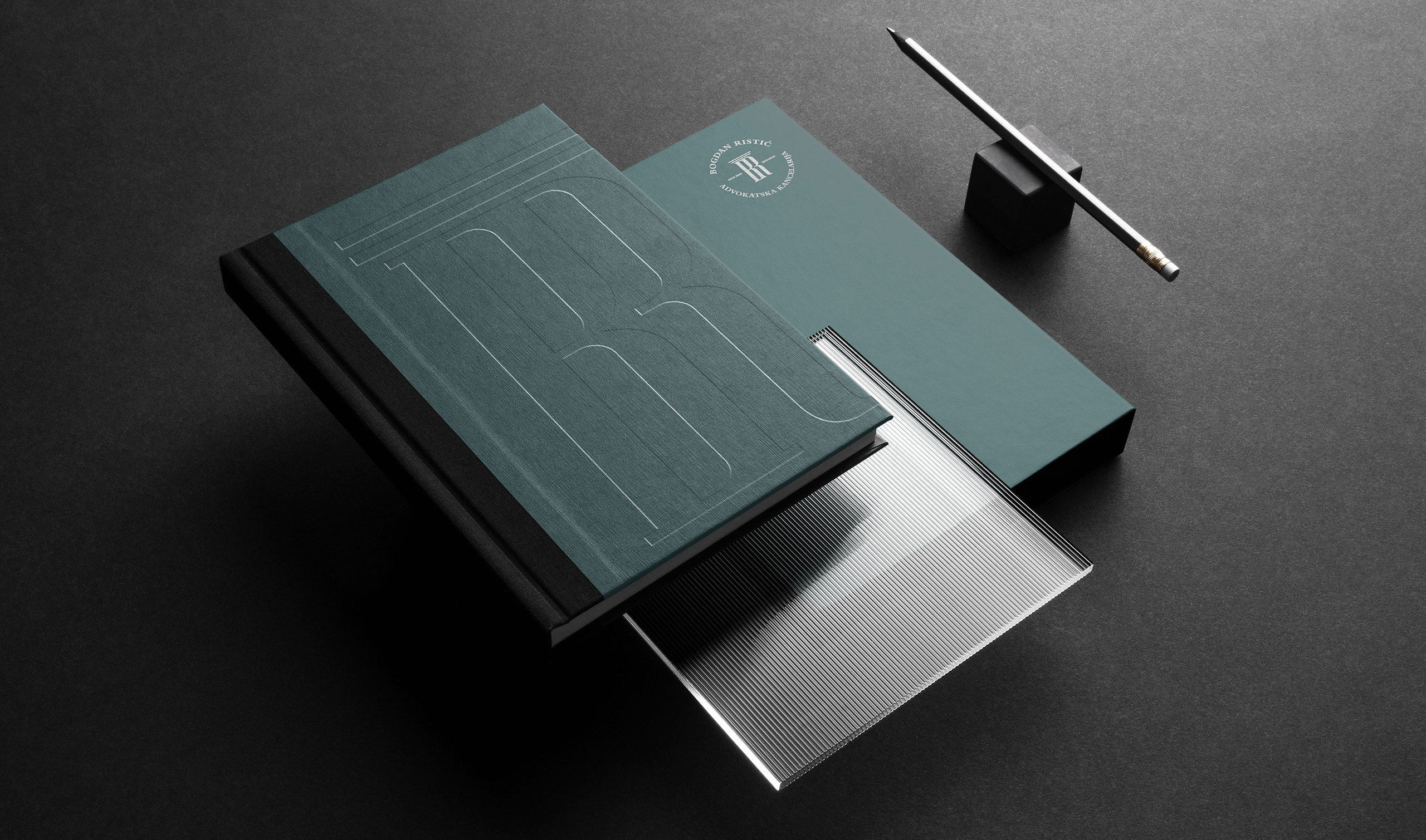
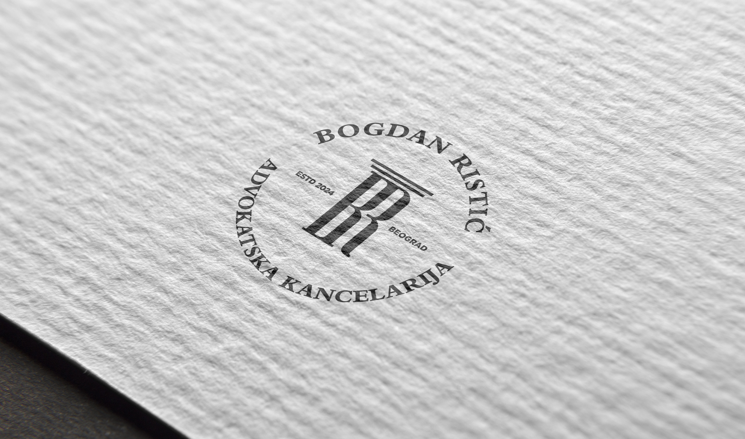
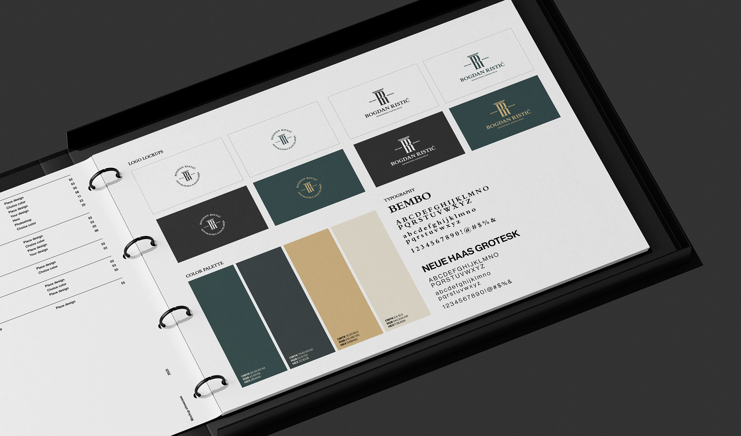
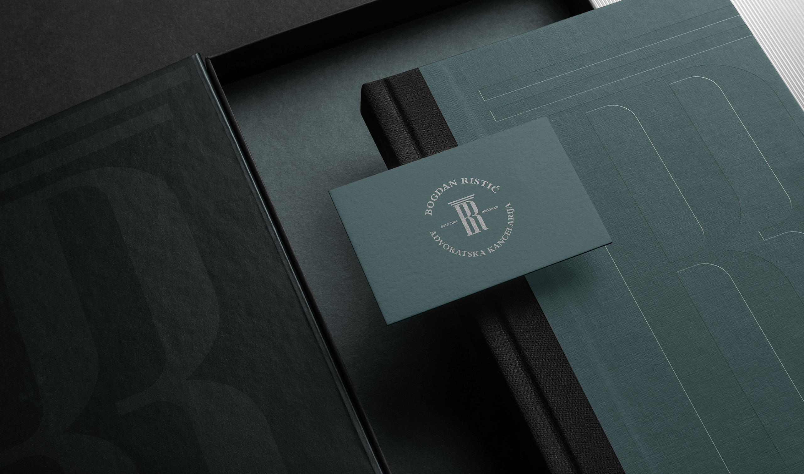
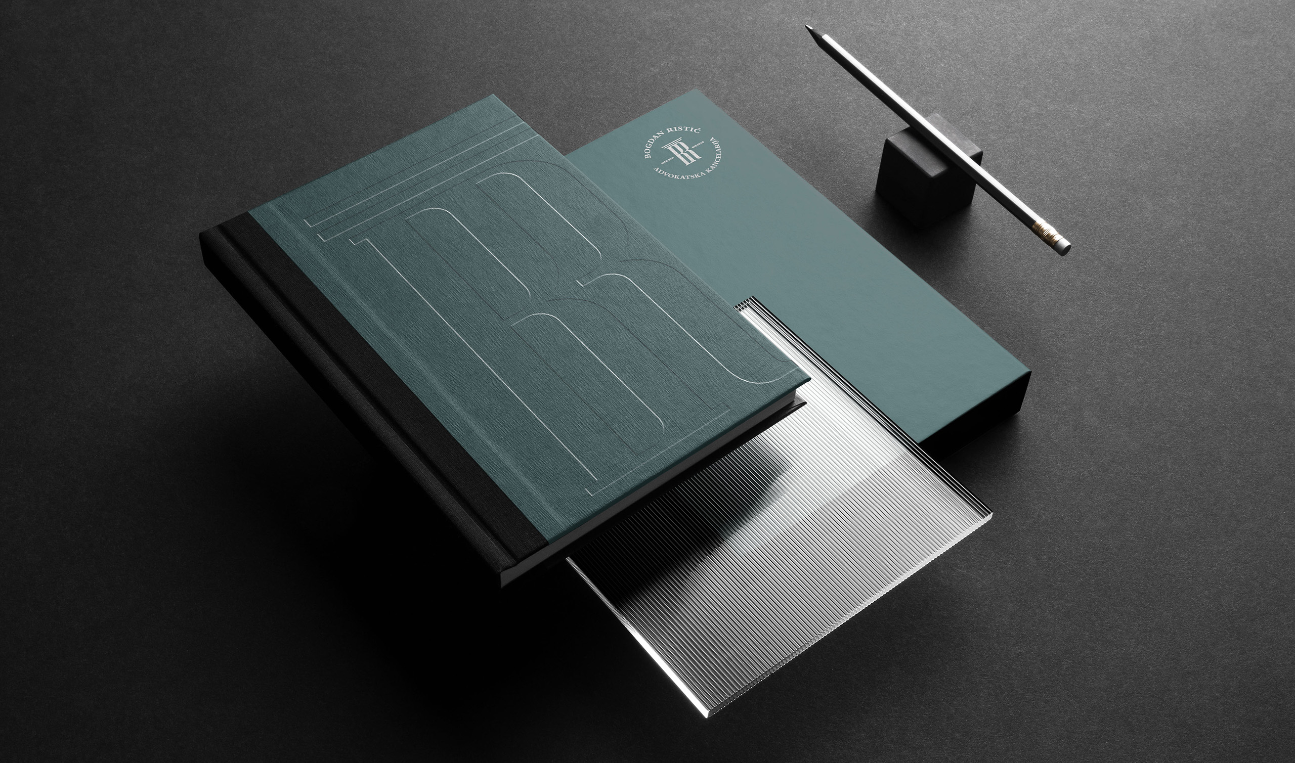
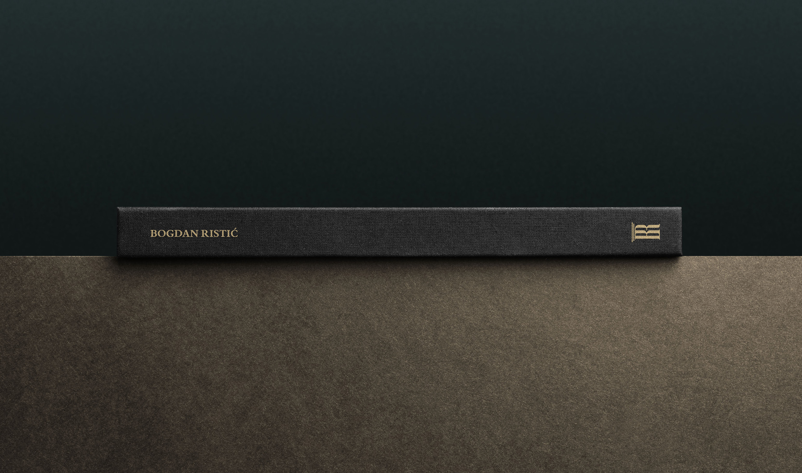
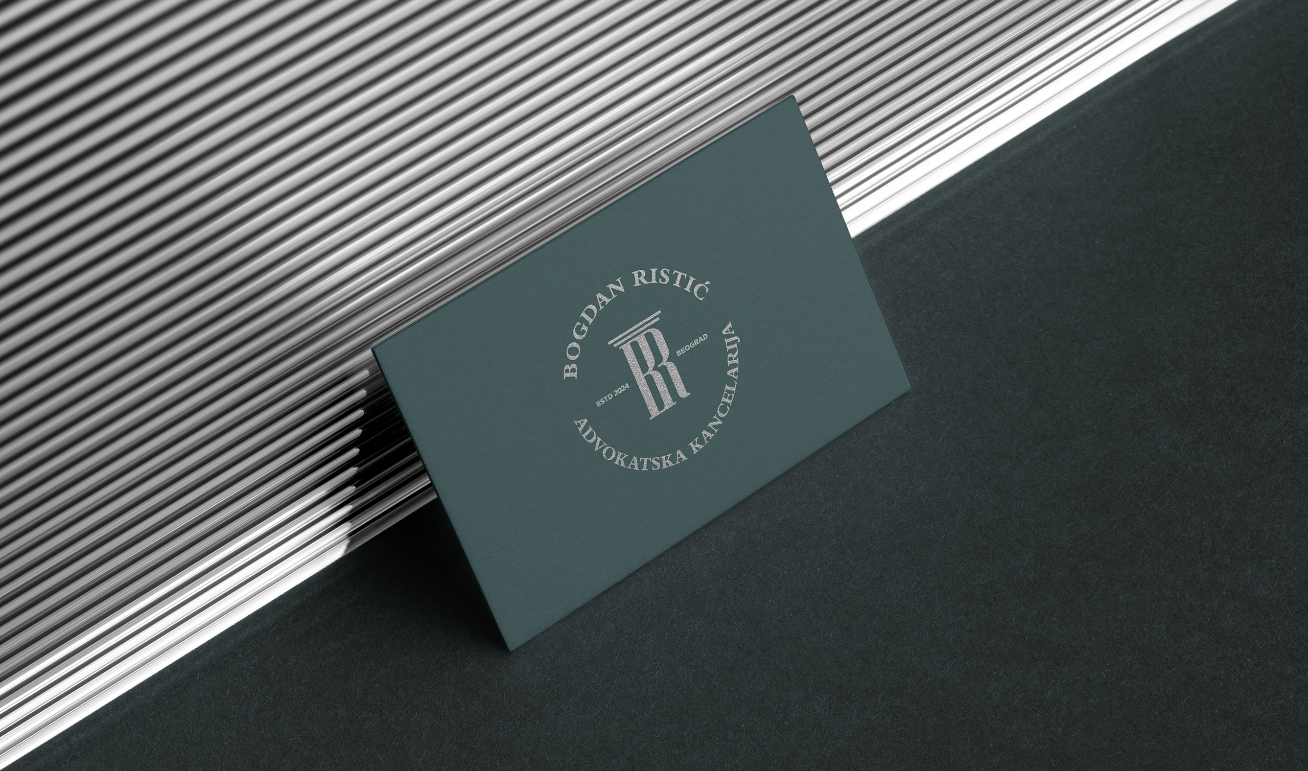
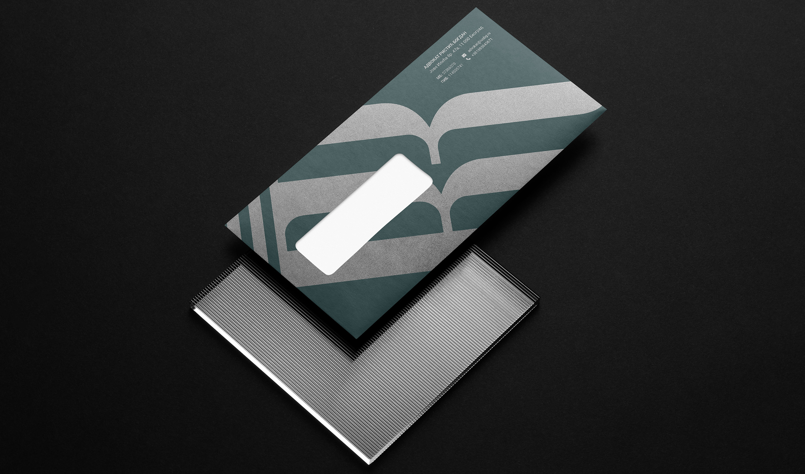
I started with the monogram. The letters B and R were drawn together into the shape of a classical column, an architectural symbol long tied to law and institutions, and a quiet reminder that the practice stands on one name. I set the mark inside a circular seal that echoes official stamps, so it feels at home on legal documents. Instead of the expected navy or burgundy, I chose a deep teal, balanced with charcoal and warm sand. An oversized, cropped B became the secondary graphic element across folders, notebooks and the backs of business cards, while blind embossing and tone-on-tone printing keep everything understated.
The office now has a complete, cohesive identity ready for everyday legal work, from the card handed over in a first meeting to the folder that holds a client’s case. Every piece speaks with the same calm authority. The details, like the embossed seal, the textured papers and the tone-on-tone B, reward a second look, which is exactly the kind of care clients expect from the people handling their affairs.